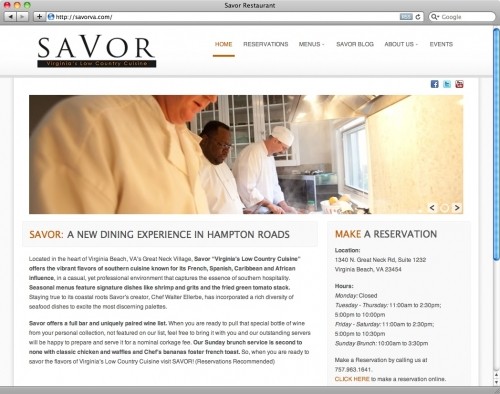
Websites - Your Brand's Hub
A large part of my day is spent researching websites. I look for new trends, cool designs and personality but most of all I look for functionality. In the digital age we live in it is very easy to get an online presence but not so easy to get a good one!
Sure you could take all of your printed material and have that uploaded to www.cheapwebsites.com (not sure if thats a real site) in order to have an online brochure but that isn't how the public interacts online.
People go to websites to accomplish specific goals and depending on your brand and business that online experience may be the only contact with your company a customer may have or at least the first impression of your company.
Well, you know what they say, "You never get a second chance to make a first impression", so you should not take your website for granted. It needn't be flashy or have music or be what I call graphically noisy (every inch covered with graphics). It just needs to communicate your brand and message clearly.
My style of design tends to be clean, clear and open. I leave very little room for there to be misunderstandings about the purpose of your visit. I do this by designing each website with the end user and their experience in mind.
When you design your website or speak to someone about your site you should keep a few things in mind.
- Your website should convey a clear message about who you are.
- It should usher people through the designed experience with no confusion
- It should not be text heavy - short clear messages or pictures/icons are great ways to achieve brevity.
- There should be a natural progression through what ever process you have designed for your visitor.
- Consistency is Critical - Each page should look like its a part of the same brand. I shy away from even changing colors on different pages. I want the visitors to know they are still on the same site they started with every step of the way.
- Your brand should be well represented on your site but it need not be center stage but more so the backdrop to your communication.
- A call to action should always exist, even if you just ask your visitors to join your facebook fan page, follow you on twitter or join your other social networks.
- Do not use pre made cookie cutter sites if you can at all help it. They are free for a reason. You would be better served with a well designed landing page with a couple of functions then to not be taken seriously because of your inadequate design.
- Make sure your message is the star, not the graphic artist or web designer. Less is more think Facebook Versus Myspace, who wins?
- If you want visitors to take you serious one of the best ways to make this happen is by investing in High Resolution Professional Photography. There is absolutely no substitute!
In a future blog I will take you through my web design process step by step but I hope this is helpful to your brand's digital journey.
Make Money, Have Fun, Be A Blessing,
Cirilo


